| |
ni problema  dobis takoj link, sem neki probavu tut z frameset, pa mi je kr ene errore kazal in se mi je DW zapiru dobis takoj link, sem neki probavu tut z frameset, pa mi je kr ene errore kazal in se mi je DW zapiru 
spremenil: Freaak (20.6.2009 ob 17.00.38)
|
| |
| |
<!DOCTYPE html PUBLIC "-//W3C//DTD XHTML 1.0 Transitional//EN" "http://www.w3.org/TR/xhtml1/DTD/xhtm....
<html xmlns="http://www.w3.org/1999/xhtml"&g....
<head>
<meta http-equiv="Content-Type" content="text/html; charset=utf-8" />
<title>Untitled Document</title>
<style type="text/css">
<!--
body {
font: 100% Verdana, Arial, Helvetica, sans-serif;
background: #666666;
margin: 0; /* it's good practice to zero the margin and padding of the body element to account for differing browser defaults */
padding: 0;
text-align: center; /* this centers the container in IE 5* browsers. The text is then set to the left aligned default in the #container selector */
color: #000000;
}
.thrColLiqHdr #container {
width: 80%; /* this will create a container 80% of the browser width */
background: #FFFFFF;
margin: 0 auto; /* the auto margins (in conjunction with a width) center the page */
border: 1px solid #000000;
text-align: left; /* this overrides the text-align: center on the body element. */
}
.thrColLiqHdr #header {
background: #DDDDDD;
padding: 0 10px; /* this padding matches the left alignment of the elements in the divs that appear beneath it. If an image is used in the #header instead of text, you may want to remove the padding. */
}
.thrColLiqHdr #header h1 {
margin: 0; /* zeroing the margin of the last element in the #header div will avoid margin collapse - an unexplainable space between divs. If the div has a border around it, this is not necessary as that also avoids the margin collapse */
padding: 10px 0; /* using padding instead of margin will allow you to keep the element away from the edges of the div */
}
/* Tips for sidebars:
1. Since we are working in percentages, it's best not to use side padding on the sidebars. It will be added to the width for standards compliant browsers creating an unknown actual width.
2. Space between the side of the div and the elements within it can be created by placing a left and right margin on those elements as seen in the ".thrColLiqHdr #sidebar1 p" rule.
3. Since Explorer calculates widths after the parent element is rendered, you may occasionally run into unexplained bugs with percentage-based columns. If you need more predictable results, you may choose to change to pixel sized columns.
*/
.thrColLiqHdr #sidebar1 {
float: left; /* this element must precede in the source order any element you would like it be positioned next to */
width: 22%; /* since this element is floated, a width must be given */
background: #EBEBEB; /* the background color will be displayed for the length of the content in the column, but no further */
padding: 15px 0; /* top and bottom padding create visual space within this div */
}
.thrColLiqHdr #sidebar2 {
float: right; /* this element must precede in the source order any element you would like it be positioned next to */
width: 23%; /* since this element is floated, a width must be given */
background: #EBEBEB; /* the background color will be displayed for the length of the content in the column, but no further */
padding: 15px 0; /* top and bottom padding create visual space within this div */
}
.thrColLiqHdr #sidebar1 p, .thrColLiqHdr #sidebar1 h3, .thrColLiqHdr #sidebar2 p, .thrColLiqHdr #sidebar2 h3 {
margin-left: 10px; /* the left and right margin should be given to every element that will be placed in the side columns */
margin-right: 10px;
}
/* Tips for mainContent:
1. the space between the mainContent and sidebars is created with the left and right margins on the mainContent div.
2. to avoid float drop at a supported minimum 800 x 600 resolution, elements within the mainContent div should be 300px or smaller (this includes images).
3. in the Internet Explorer Conditional Comment below, the zoom property is used to give the mainContent "hasLayout." This avoids several IE-specific bugs.
*/
.thrColLiqHdr #mainContent {
margin: 0 24% 0 23.5%; /* the right and left margins on this div element creates the two outer columns on the sides of the page. No matter how much content the sidebar divs contain, the column space will remain. You can remove this margin if you want the #mainContent div's text to fill the sidebar spaces when the content in each sidebar ends. */
}
.thrColLiqHdr #footer {
padding: 0 10px; /* this padding matches the left alignment of the elements in the divs that appear above it. */
background:#DDDDDD;
}
.thrColLiqHdr #footer p {
margin: 0; /* zeroing the margins of the first element in the footer will avoid the possibility of margin collapse - a space between divs */
padding: 10px 0; /* padding on this element will create space, just as the the margin would have, without the margin collapse issue */
}
/* Miscellaneous classes for reuse */
.fltrt { /* this class can be used to float an element right in your page. The floated element must precede the element it should be next to on the page. */
float: right;
margin-left: 8px;
}
.fltlft { /* this class can be used to float an element left in your page The floated element must precede the element it should be next to on the page. */
float: left;
margin-right: 8px;
}
.clearfloat { /* this class should be placed on a div or break element and should be the final element before the close of a container that should fully contain its child floats */
clear:both;
height:0;
font-size: 1px;
line-height: 0px;
}
-->
</style><!--[if IE]>
<style type="text/css">
/* place css fixes for all versions of IE in this conditional comment */
.thrColLiqHdr #sidebar2, .thrColLiqHdr #sidebar1 { padding-top: 30px; }
.thrColLiqHdr #mainContent { zoom: 1; padding-top: 15px; }
/* the above proprietary zoom property gives IE the hasLayout it needs to avoid several bugs */
</style>
<![endif]--></head>
<body class="thrColLiqHdr">
<div id="container">
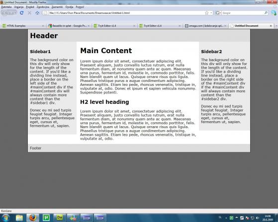
<div id="header">
<h1>Header</h1>
<!-- end #header --></div>
<div id="sidebar1">
<h3>Sidebar1 </h3>
<p>The background color on this div will only show for the length of the content. If you'd like a dividing line instead, place a border on the left side of the #mainContent div if the #mainContent div will always contain more content than the #sidebar1 div. </p>
<p>Donec eu mi sed turpis feugiat feugiat. Integer turpis arcu, pellentesque eget, cursus et, fermentum ut, sapien. </p>
<!-- end #sidebar1 --></div>
<div id="sidebar2">
<h3>Sidebar2 </h3>
<p>The background color on this div will only show for the length of the content. If you'd like a dividing line instead, place a border on the right side of the #mainContent div if the #mainContent div will always contain more content than the #sidebar2 div. </p>
<p>Donec eu mi sed turpis feugiat feugiat. Integer turpis arcu, pellentesque eget, cursus et, fermentum ut, sapien. </p>
<!-- end #sidebar2 --></div>
<div id="mainContent">
<h1> Main Content </h1>
<p>Lorem ipsum dolor sit amet, consectetuer adipiscing elit. Praesent aliquam, justo convallis luctus rutrum, erat nulla fermentum diam, at nonummy quam ante ac quam. Maecenas urna purus, fermentum id, molestie in, commodo porttitor, felis. Nam blandit quam ut lacus. Quisque ornare risus quis ligula. Phasellus tristique purus a augue condimentum adipiscing. Aenean sagittis. Etiam leo pede, rhoncus venenatis, tristique in, vulputate at, odio. Donec et ipsum et sapien vehicula nonummy. Suspendisse potenti. </p>
<h2>H2 level heading </h2>
<p>Lorem ipsum dolor sit amet, consectetuer adipiscing elit. Praesent aliquam, justo convallis luctus rutrum, erat nulla fermentum diam, at nonummy quam ante ac quam. Maecenas urna purus, fermentum id, molestie in, commodo porttitor, felis. Nam blandit quam ut lacus. Quisque ornare risus quis ligula. Phasellus tristique purus a augue condimentum adipiscing. Aenean sagittis. Etiam leo pede, rhoncus venenatis, tristique in, vulputate at, odio.</p>
<!-- end #mainContent --></div>
<!-- This clearing element should immediately follow the #mainContent div in order to force the #container div to contain all child floats --><br class="clearfloat" />
<div id="footer">
<p>Footer</p>
<!-- end #footer --></div>
<!-- end #container --></div>
</body>
</html>
evo to je komplet koda, vendar naj povem, da se samo učim oz. delam primer na tem. ko bom znal ozadje, tabelo bom šel urejat besedilo, vendar bom še vseeno izhajal iz te podloge
|
| |
| |
Kljuka, deluje, ampak mi nardi samo za majhno vrstico , pa tut tabelo mi potisne navzdol
rad bi da mi to nardi uzadi za "glavno" tabelo, pa zanima me ker ukaz je, da mi nardi na to "glavno" tabelo npr. 80% prosojno, da se vidi ozadje, vendar se opazi da je že tabela? Išči na Googlu: div transparent
Sem ti jaz nekaj najdel:
<div class="transparent">A transparent div.

</div>
Potem pa v CSSju dodaš kodo:
.transparent

{

   filter:alpha(opacity=60);

   -moz-opacity: 0.6;

   opacity: 0.6;

}
ali
DIV

{

filter: alpha(opacity=50);

}
ali
<div id="fsm"

style="position:absolute;

width:100;border:1px solid #6694D3;

padding:0px;

opacity=0.3;

filter:alpha(opacity: 0.3);

>
Pa še primer celotne HTML kode:
<!DOCTYPE html PUBLIC "-//W3C//DTD XHTML 1.0 Transitional//EN" "http://www.w3.org/TR/xhtml1/DTD/xhtm....

<html>

<head>

    <title>HTML Div Transparent</title>

    <style type="text/css">


    .outerDivBg{

    background-color:#FF0000;

    width:300px;

    padding:5px;

    }


    .innerDivBg{

    border:solid 2px #00FF00;

    background-color:#FFFF00;

    opacity:.5;

    width:98%;

    margin:0px auto;

    }

    </style>


</head>


<body>


    <div class="outerDivBg">

        <div class="innerDivBg">

            This HTML Div tag is transparent.<br />

            Basckground color of nested div is yellow.<br />

            But Opacity CSS property has changed the output color into

            color mixture of yellow and red to orange color.

        </div>

    </div>


</body>


</html>
LP,
aleks
p.s.: če boš imel težave povej.
|
| |
| |
Tole dodaj zgoraj v style:
#mainContent {

background-image: img(hopsasa.jpg) repeat-y bottom left;

}
|
| |
| |
aleksy hvala za pomoč, sem probal z vsemi tvoji predlogi in tut z enim mi ni ratal
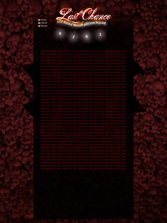
No je kdo kej pogruntu kako bi kej zaoblu tabelo? 
|
| |
| |
Evo najdu sm narejeno stran v DW, in je narjena na glavi z opacity , vendar ni nikjer opisan kako je prsu do tega , v glavnem to bi rabu
|
| |
| |
Slika, ki je za ozadje besedila je tako narejena. Poglej si lekcije za Photoshop.
|
| |
| |
se pravi se da to naredit samo z photoshopom??
probavu sm tut z unim filter alpha opacity pa nedela , če se da pa samo v photoshopu 
|
| |
| |
Ja, lahko samo s photoshopom.
|
| |
| |
no, dober ta zadeva koncana  mi lahko potem še pomagate, kako bi naredu zaobleno tabelo kot na zmaga.si mi lahko potem še pomagate, kako bi naredu zaobleno tabelo kot na zmaga.si
|
| |
Prikazujem 3 od skupno 5 strani |
|